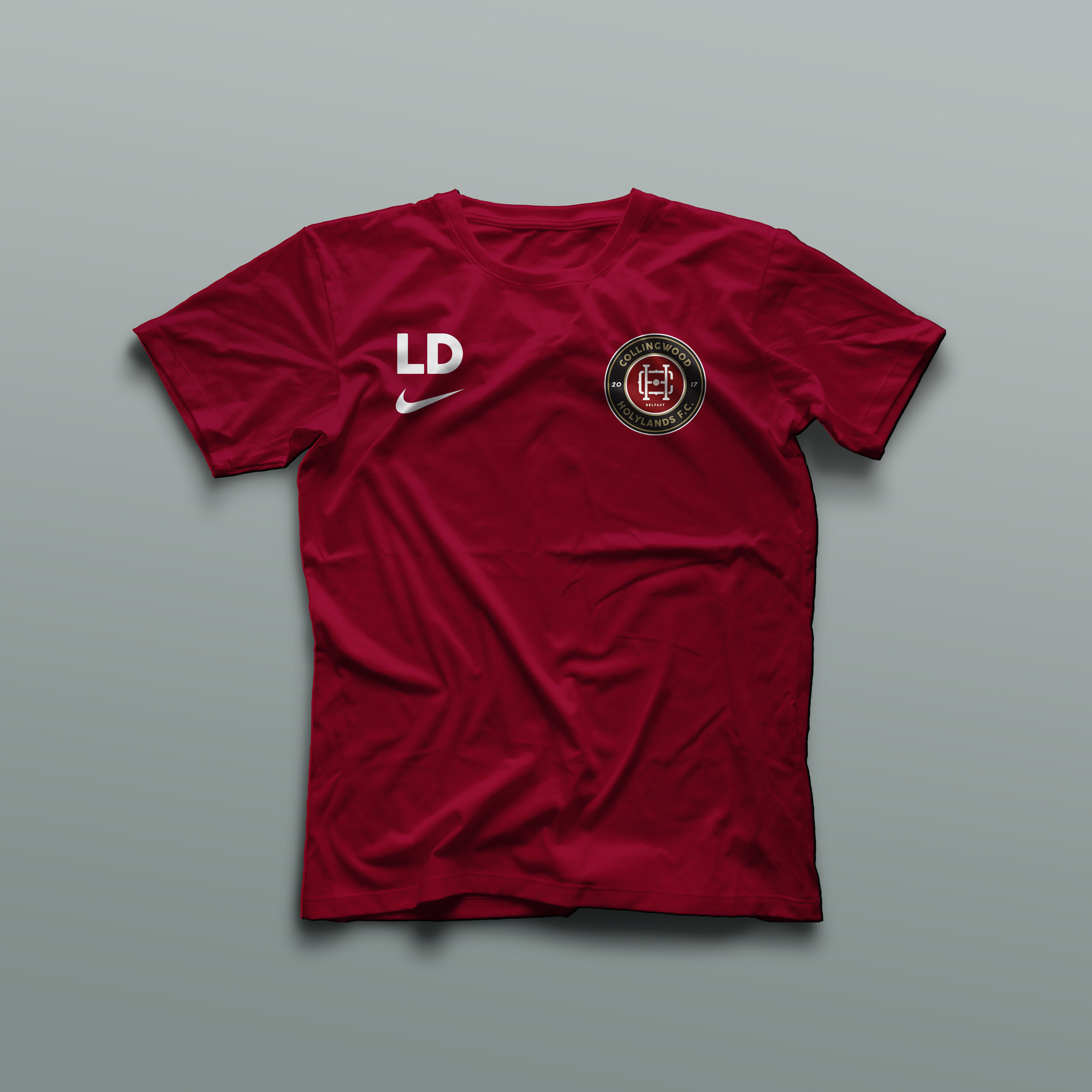
Collingwood Holylands Football Club
Role: Creative Direction
The Brief.
When 2 Belfast District Football Clubs – Collingwood F.C. and Holylands F.C., amalgamated together they needed an identity to represent the new beginning.
The Idea.
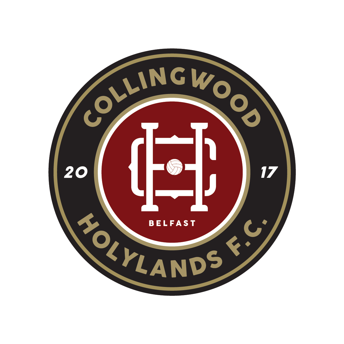
A timeless badge of honour to represent a fresh start for the club with a crest that is clean and modern yet with a nod to heritage elements of “the beautiful game”.
Both clubs had their own distinct history/identity to draw from and this needed to be respected – but not allowed to dictate the direction. Design in football had also become more mainstream, with clubs like Juventus opting for a more brand-driven approach to take advantage of the demands of the modern fanbase.
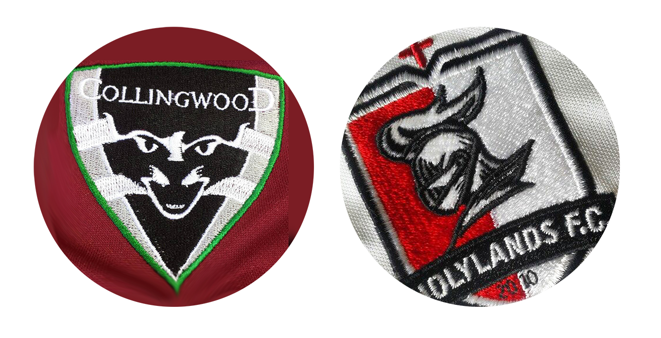
While the existing graphical elements of the two clubs (a cat and a knight) would not blend together well, using a monogram approach I was able to integrate the C and H initials together in a stylised format showcasing the “better together” attitude.

The addition of a vintage style football and the Belfast location front and centre ensures this is instantly recognisable as a football logo. As we went quite retro with the inner monogram I wanted to make sure that the rest of the piece felt modern so I went with a clean circlular shield to house everything in and a modern sans serif font to make sure that this has a nice blend. The result is a clean design that portrays a feeling of pride and achievement; in short a badge worth competing for.