Principal HVAC
Role: Creative Direction
The Brief.
Belfast based ventilation company Principal Cooling were rebranding as Principal HVAC. They needed a full identity upgrade to support the evolution.
The Idea.
Principal by definition means being the best, therefore I wanted to reflect that premium standing with a brand design that instantly communicates quality services to the consumer.

There were a number of reasons for the rebrand that needed to be kept top of mind. The company had evolved its offering far beyond refrigeration services, the “cooling” name felt counterproductive.

The existing brand also did little to present the company as a serious operator, feedback was that many still saw Principal as a “man in a van” style outfit rather than a company that employs a few thousand staff across 3 countries.
Focusing on the “P” itself provided an opportunity to create an ownable icon – one that could be regarded as a badge of excellence. I created a custom visual utilising air currents to form the P shape.
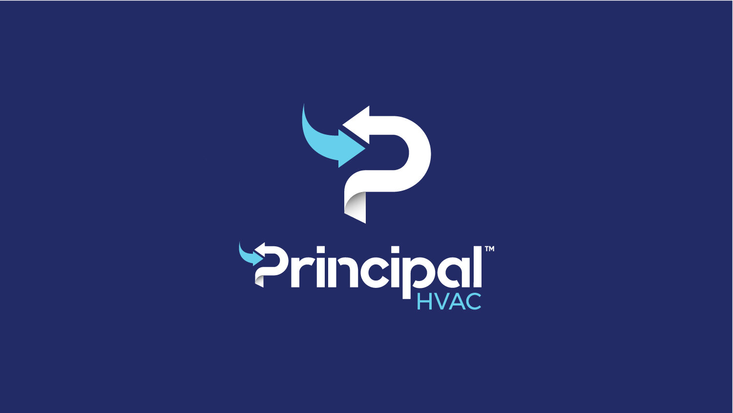

For the word mark, the modern serif font utilises some striking curved edges, providing a dynamic energy and further connecting to the air currents involved in the core services. The colour palette utilises a solid and stable royal blue, with a dynamic sky blue to add energy.

A new tagline and suite of icons were created to allow the brand to fully communicate their positioning and wide variety of services to the potential consumer.


The blue colouring of uniform materials also allows the brand to stand out when in-field or on-site.
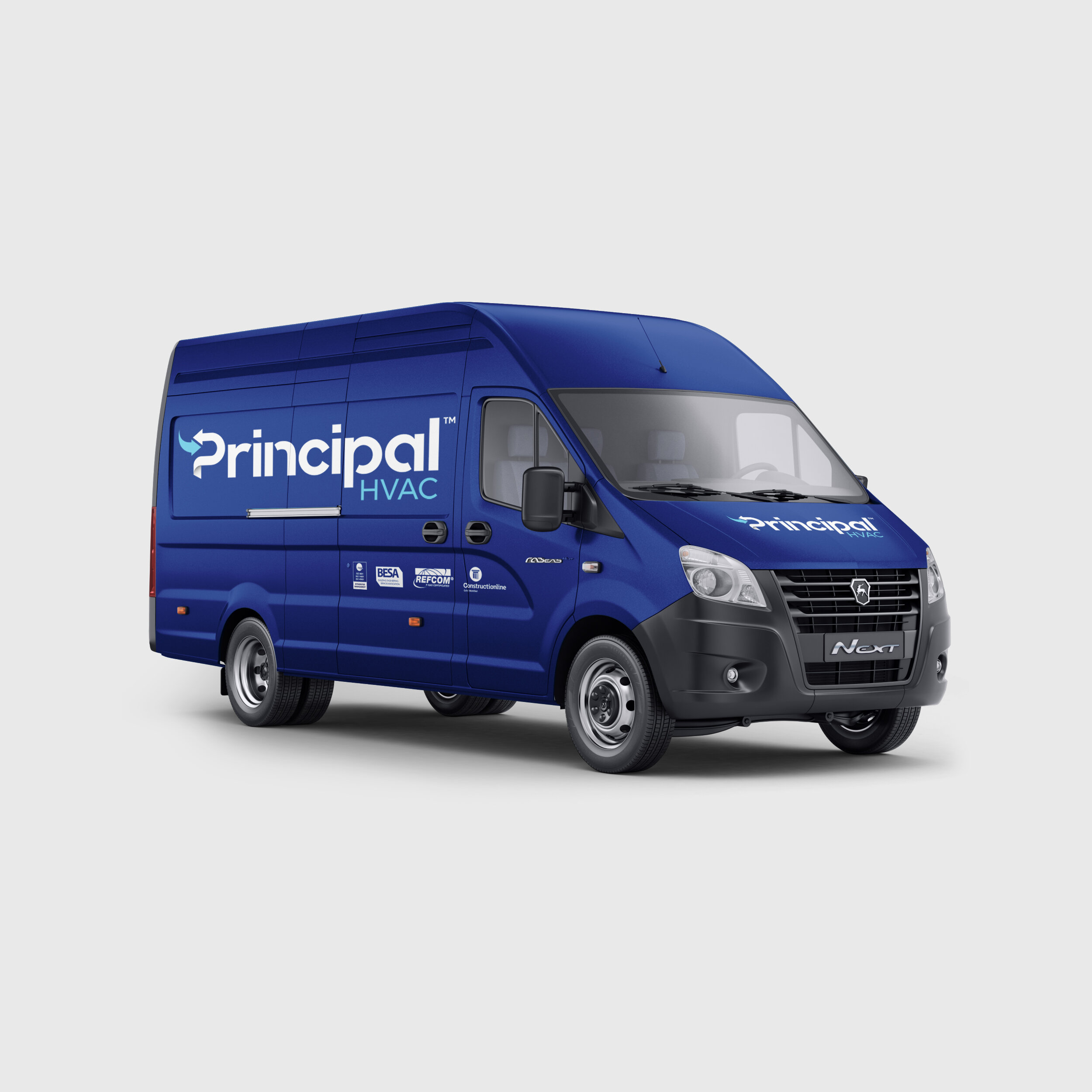
I recommended the vehicles be wrapped in a matte blue vinyl to ensure they look distinctive in a typical “white van” market.