Canada GAA
Role: Creative Direction
The Brief.
Canada GAA wanted an updated identity to reflect the improving standing of the sports within the nation.
The Idea.
I created a more dynamic, contemporary identity that communicated some of the key drivers of the game and the association.


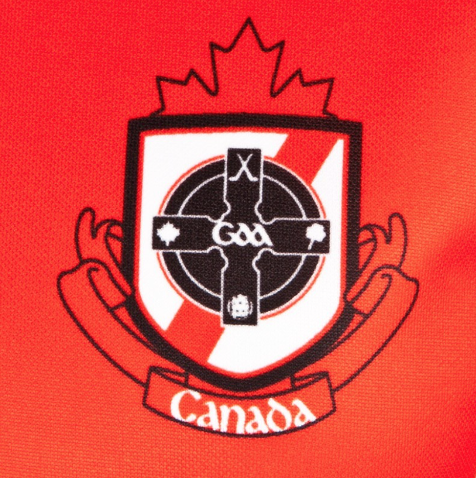
While the existing crest was extremely dated, the association didn’t want to depart too far from the key visual elements; namely the maple leaf, shamrock, hurls and football.
Knowing that I couldn’t get too abstract, I utilised a common Irish cultural visual element, the Celtic cross, along a introducing a stylised maple leaf at the top. I integrated everything within a more contemporary and polished shield.
To bring the design together, I created a custom word mark (in Gaelic and English) that could be utilised along with, or seperately to the crest.
On jersey close up

Canada jersey World Gaelic Games
After developing the crest, the next step was to create a campaign focused on growing the sport. As the Irish population of Canada is quite nomadic, it is important to promote the game with locals (and other nationalities) who will be there long term.

With this insight in mind, I created a rallying call in the form of a hashtag that, in combination with the vibrant red and white and supporting action shots, highlights the competitiveness of the game but also the sense of belonging and community at the heart of it all.

The integration of an upwards pointing arrow acted as a visual cue to connect to the “North” geographical element and wilderness spirit upon which the country is so proud. The element can also symbolise a dedicated spirit in regards to the game itself, always pushing forward no matter what.